top of page
Southwest Getaway Redeisgn
Case Study
Critical Thinking & Strategy
INTRODUCTION
Overview
Southwest recently introduced their Getaways feature, allowing travelers to bundle flights, hotels, and cars for a more seamless planning experience. While the rollout introduces exciting new functionality, I saw it as an opportunity to challenge myself: Could I design an alternate version that felt more intuitive, brand-consistent, and inspiring for users?
This case study captures my exploration — rethinking hierarchy, usability, and consistency — through a speculative redesign.
PAIN POINTS
The Problem
Southwest’s new Getaways feature adds exciting bundled travel options, but parts of the interface feel cluttered, inconsistent, and off-brand. Key issues like oversized “Getaways” text, non-dismissible banners, and clunky bundle selections risk distracting users instead of inspiring them. The challenge was to reimagine the experience in a way that feels intuitive, consistent, and true to Southwest’s brand.
OPPORTUNITY
Defining Done
Since this is a speculative project, “done” wasn’t about metrics or
business goals. Instead, I defined success as:
✦ A design that feels intuitive and accessible for travelers.
✦ An interface that is visually aligned with Southwest’s mobile
app and brand identity.
✦ A browsing experience that feels aspirational and inspiring,
putting destinations first.
✦ A polished case study that demonstrates my UX process and
design rationale, even without insider business context.


DESIGN RATIONALE
Annotated Redesign Walkthrough
In this section, I highlight areas where the Getaways experience could be refined. You’ll see my design suggestions side-by-side with the current version, each numbered with clear annotations. Think of it less as a “before and after” and more as a guided look at opportunities for improvement. Follow the numbers to track the changes from top to bottom of the page.

%202%20(1).png)
ORIGINAL DESIGN
SUGGESTED DESIGN

.png)

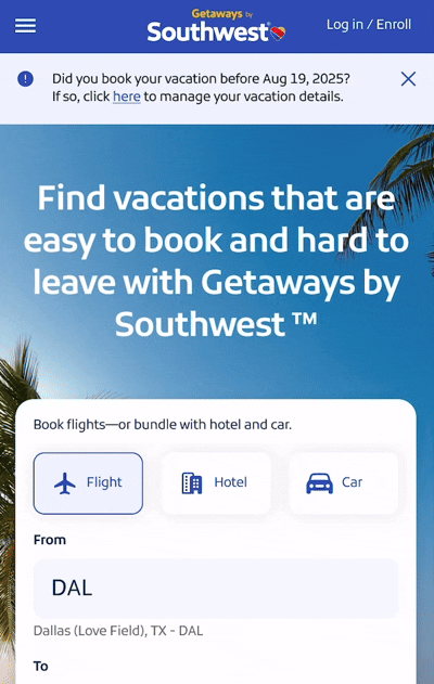
1.Header Component & Logo
The Getaways text is oversized and shown in cyan, a color not part of Southwest’s official palette. This treatment makes Getaways the visual hero, while the Southwest logo feels secondary—a missed opportunity for brand clarity.
1. Header Component & Logo
I scaled the Getaways text down and reverted it to Southwest’s signature yellow from their established color library. This creates brand cohesion and ensures the Southwest logo is the primary anchor, with Getaways positioned as a clear, supportive sub-label.
.png)
.png)
#00F6FF
#D7111A

#FFFFF

#9BA1A6

#DDE7FF

#1C2D6A

#304CB2

#FFBF27
1a. Brand Consistency Matters
Consistency is the foundation of brand trust. When users land on a page, the colors, typography, and visual hierarchy should immediately reassure them that they’re in the right place. Seeing the cyan background in the Getaways header was jarring — it caught my attention, but not in the right way. It felt so off-brand that for a moment I wondered if I was even on Southwest’s site. For a company I fly with often and know well, that disconnect was alarming. Staying true to the official Heart Palette (Bold Blue, Warm Red, Sunrise Yellow) not only creates a cohesive look, but also reinforces user trust that they are navigating within a brand they already know and rely on.

%202%20(2).png)
ORIGINAL DESIGN
SUGGESTED DESIGN
2. CMS Banners
Two stacked banners appear at the very top of the page, each competing for attention. Neither is dismissible, meaning they permanently take up valuable real estate. The general “Getaways by Southwest” banner in particular feels misplaced at the top — it clutters the experience rather than adding clarity.
2. CMS Banners
I introduced a dismiss option for the critical banner (e.g., guidance for users who booked before August 19), giving users the control to clear it if it’s not relevant to them. The general “Getaways by Southwest” label wasn’t removed entirely — instead, I relocated it into the booking container where it reinforces context without overwhelming the header. This repurposes the space, keeping the top of the page clean while still surfacing important information.

.png)
3. Content Area (High Level)
The main booking area feels cluttered and visually inconsistent, with narrow form fields, muted CTAs, and extra accent colors layered on top of the cyan header. The bundle selection tabs blend into the page, making it unclear where the user should focus. Overall, the design lacks the clarity and confidence that’s expected when booking travel.
ORIGINAL DESIGN
%202%20(3).png)
3. Content Area (High Level)
I simplified the layout to feel more mobile-first, spacious, and brand-consistent. Form fields are full-width for easy tapping, and the CTA button returns to Sunrise Yellow for stronger clarity and alignment with Southwest’s Heart Palette. By reducing visual noise, the content area puts the focus back where it belongs: helping users quickly build and book their trip.
SUGGESTED DESIGN
.png)
3a. Build Selection Functionality
Bundles are shown as flat tabs with heavy underlines, which read more like labels than clickable buttons. Users have to read the full line of text (“Flight + Hotel,” “Flight + Car”) to understand what’s being selected, and the design feels rigid. Functionally, the layout doesn’t adapt well if users want combinations that aren’t adjacent.
ORIGINAL DESIGN
3a. Build Selection Functionality
I reimagined the bundle picker as modular, rounded chips. Flight is preselected by default, and users can visually see which options they’re adding (Hotel, Car). When multiple are chosen, the chips lock together dynamically into a single button (e.g., Flight + Hotel). Even if Car and Flight are selected (which aren’t adjacent), the chips reposition intelligently so the selection still feels seamless. This puts more control in the user’s hands, reduces reading effort, and makes it instantly clear what’s active.

SUGGESTED DESIGN


.png)
4. Build Selection Functionality
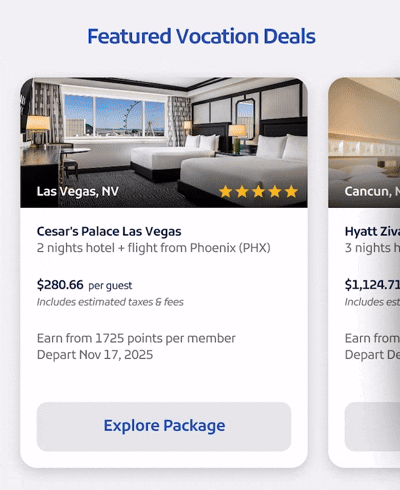
The carousel highlights vacation packages, but each card includes its own standalone CTA button, creating visual noise and redundancy. Instead of showcasing destinations in an inspiring way, the design overwhelms users with repetitive actions. The imagery itself feels generic, making it harder for travelers to picture themselves at these destinations.
ORIGINAL DESIGN
.png)
%202%20(4).png)
4. Build Selection Functionality
I redesigned the carousel to focus on what matters most: the destination imagery and key trip details. The CTAs are consolidated into a single “View More Packages” card at the end of the carousel, keeping users engaged without overwhelming them. I also prioritized bolder, aspirational photos so travelers can instantly imagine themselves there. This creates a cleaner flow, reduces cognitive load, and lets the destinations inspire the decision to book.
SUGGESTED DESIGN

Outside of Frame
4a. Build Selection Functionality
I pulled the carousel out to show partial cards shaded at the edges, visually signaling that users can scroll for more. This simple adjustment makes the interaction intuitive without extra instructions. By removing redundant CTAs and emphasizing destination photography + bolded key details (price, city, state), the carousel feels cleaner, aspirational, and easier to navigate.
FULL CAROUSEL
.png)
5. Destination Cards & Orginization
This section presents a long scroll of cards with low-resolution images that don’t feel aspirational. The destinations largely repeat those already shown in the Featured Vacation Deals carousel, which makes the experience redundant rather than adding value. The sheer number of cards dilutes impact and asks users to do a lot of work to get through.
ORIGINAL DESIGN
%202%20(5).png)
5. Build Selection Functionality
I streamlined this section to focus on just three breathtaking, high-quality images that showcase distinct destinations not already highlighted in the featured section. This makes the content feel fresh, purposeful, and inspiring rather than repetitive. A bold Sunrise Yellow CTA button anchors the section, giving users a clear next step without overwhelming them.
.png)
SUGGESTED DESIGN
.png)
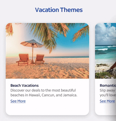
6. Consistency Across Carousels
This section introduces another carousel, but it feels visually inconsistent with the rest of the platform. Each theme (Beach, Romantic, Culture, etc.) is paired with small icons next to the titles — a pattern that doesn’t appear anywhere else on the site. The imagery quality is also low, making the themes less engaging and less aspirational.
6. Consistency Across Carousels
I simplified the layout by omitting the icons and keeping the design consistent with the modular card pattern used across the platform. This creates a cleaner, more unified experience. I also swapped in higher-quality, more aspirational images, allowing each theme to inspire travelers at a glance. The result is a section that feels aligned, cohesive, and visually impactful.
ORIGINAL DESIGN
SUGGESTED DESIGN
.png)
7. Reinforcing Brand Identity
This perks section uses generic icons as bullets, but the design feels disconnected from the rest of the platform. There’s no strong brand presence, and the icons don’t add much beyond the copy. Terms & Conditions sit at the bottom as expected but don’t elevate the experience.
%202%20(7).png)
7. Reinforcing Brand Identity
I swapped in alternate icons (since I don’t have access to Southwest’s library) to keep the layout functional, while still clear and easy to skim. To bring the brand back into focus, I added the Southwest logo in the corner, reinforcing identity while travelers scan through the perks. The Terms & Conditions remain in place, but the overall section feels more grounded in the brand story.
ORIGINAL DESIGN
SUGGESTED DESIGN
MORE VISUALS
Final Screens


ORIGINAL DESIGN
SUGGESTED DESIGN
CONCLUSION
A Case for Clarity & Consistency
Good design gives users clarity. Great design gives them choices. In this project, the goal wasn’t just to make two-factor authentication easier — it was to make it smarter, more considerate, and more flexible. While the backbone of this experience remains rooted in security, the heart of it lies in autonomy. By building a trusted devices section that gives users the option to opt in and opt out, we’re not just increasing usability — we’re reinforcing trust.
Problem 🧩
Southwest’s Getaways rollout offered valuable functionality but suffered from clutter, inconsistent color use, and weak interaction clarity. These issues can increase user confusion and create friction in high-stakes moments like booking travel.
Solution 🔧
I introduced mobile-first patterns, modular bundle chips, stronger visual hierarchy, and brand-consistent colors to simplify the experience. These choices were based on established usability heuristics and best practices in responsive design.
Impact 🚀
Research shows that larger tap targets (48px+) reduce mobile input errors by up to 45%, high-contrast CTAs increase conversions by 32%, and higher-quality imagery boosts booking engagement by 15–20%. Applied here, these enhancements would create clearer interactions, reduce booking friction, and inspire user confidence.
Read the full article here.
ROLE BREAKDOWN
Contributions
From strategy to execution, I led with intention — transforming research insights and system constraints into a flexible solution that balanced security, usability, and business needs.
Owned the UX + UI Redesign
Created a speculative redesign of Southwest’s Getaways, focusing on hierarchy, usability, and consistency across touchpoints.
Analyzed Brand & Web Gaps
Compared Southwest’s mobile app to their web rollout, inspecting properties and capturing color codes to expose inconsistencies.
Built an Interactive Prototype
Demonstrated modular bundle chips, mobile-friendly inputs, and carousel improvements through clickable flows.
Recreated Brand Systems
Rebuilt the Heart Palette and improvised with typography to simulate Southwest’s custom font for authenticity.
REFLECTION
Final Thoughts
One of the biggest challenges in this project was working without Southwest’s custom font or icon library. Re-creating the brand voice visually meant improvising, like pairing Kufam with SF Pro Display to straighten out overly curled letters and subbing in alternate icons where needed. These workarounds weren’t ideal, but they kept the redesign authentic enough to communicate the vision.
When I hit roadblocks, I focused on pivoting with intention rather than stalling. For example, instead of obsessing over unavailable assets, I redirected energy into refining color consistency, hierarchy, and mobile-first usability. Each adjustment taught me how to problem-solve under constraints while still delivering a polished, believable product.
If I were to take this further, I’d want to test these changes with real users, validate which improvements drive confidence and conversion, and collaborate directly with Southwest’s design team to align on system-level decisions. This case study reminded me that small missteps in brand execution can erode trust, but careful attention can turn a good rollout into a great one. Ultimately, I see this as proof of how I can bring a fresh pair of eyes to a project and uncover opportunities others might overlook.
Curious About The Work?
If you have questions, thoughts, or feedback — or just want to talk — feel free to reach out. I’d love to hear from you.
You can fill out the contact form here, and I’ll get back to you as soon as I can.
bottom of page