top of page
Creating Page Templates
UX Designer
Design System & Standards
INTRODUCTION
Overview
When design consistency started slipping through the cracks, templates became the glue that brought everything back together. This project transformed the way our team builds — reducing guesswork, reinforcing standards, and giving designers the tools to work faster and smarter.
PAIN POINTS
The Problem
Despite having a solid design system in place, our team struggled with consistency across pages. Designers often built layouts from scratch, which led to misaligned spacing, forgotten standards, and confusion during design QA. Even with documentation, too much time was spent rechecking guidelines or second-guessing visual decisions — slowing us down and making us look fragmented in front of engineering.
.png)

.png)

DEFING DONE
Opportunity
If we could standardize our most-used page structures into flexible templates, we could dramatically reduce inconsistency while saving time. A successful outcome would mean designers no longer have to “figure it out” every time they build a page — instead, they can rely on smart defaults, hidden layers, and shared components to stay in alignment. Done well, this would create a faster, more cohesive workflow while reinforcing trust across the product team.
PRELIMINARY RESEARCH
Tag Generation Exercise
Before building the templates, I conducted an informal word association exercise with our design team. I presented unlabeled screenshots of commonly used pages and asked teammates to drag labels (like “data,” “profile,” “search”) onto the ones they felt matched. This helped me identify intuitive tags that would later improve searchability and adoption across our component library — even for designers unfamiliar with specific page names.


EXECUTION
Template Strategy
The goal of this project was to simplify our workflows and enforce consistency across our design system. Templates were created to act as a foundation for building pages without having to start from scratch. Each layout — including tables, forms, dashboards, and hybrid combinations — was designed to be configurable, with hidden layers and placeholders to support flexibility without sacrificing standards.
This wasn’t about reinventing the wheel. It was about giving designers a smarter way to reuse it. With componentized templates and clear tagging, we’ve replaced hours of spacing tweaks and review debates with aligned expectations and reliable design structure.


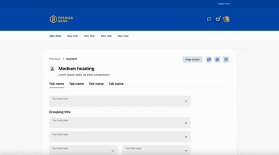
FRAMES
Desktop Templates & Side Sheets
These templates were intentionally built to cut down on design time and reduce inconsistencies across our platform. Instead of reinventing layouts, designers can now drag in a pre-built page and hide or reveal elements based on what’s needed. This eliminates the need to manually tweak padding, remember spacing specs, or double-check documentation every time a page is created. With these layouts, design decisions are already baked in.


CONCLUSION
Beyond Color Inversion
Designing for dark mode doesn’t have to be convoluted — it just has to make sense. While contrast plays a major role in decision-making, it’s not as simple as inverting colors. Many color assignments from light mode fall flat in darker environments. To mitigate this, we carefully planned and mapped new token relationships that prioritized legibility and tone. The end result? Accurate documentation that gives developers guidance at the component level, not just the color level — because where a color shows up in light mode isn’t always where it should live in dark mode.
Problem 🧩
Our designs were becoming inconsistent — spacing was off, standards were unclear, and design QA often exposed misalignment that could have been avoided.
Solution 🔧
We introduced flexible, component-based templates designed around our most commonly used page structures. These templates are taggable, searchable, and fully configurable.
Impact 🚀
This change reduced average time to create a page by ~75% (2 hours → 30 minutes). It cut down alignment/spacing revisions in reviews by 40%. This also saved an estimated 20+ team hours per week across 12 designers.
ROLE BREAKDOWN
Contributions
From logic to rollout, I brought clarity to every layer of this dark mode system — with decisions rooted in accessibility and design intent.
Audited Existing Pages
Reviewed which layouts were frequently used and which ones could be retired, ensuring only relevant templates were built.
Facilitated Research Exercise
Led a team activity to gather intuitive tags for each template, improving discoverability in our design system.
Built Templates
Created modular page and side sheet layouts with placeholder content, optional fields, and standardized spacing. Turned templates into smart components with variants so designers could swap layouts without detaching.
Improved Design Standards
Used this system as a tool to reinforce spacing, layout, and alignment standards across our team’s work
REFLECTION
Final Thoughts
The final deliverable was a library of fully componentized page and side sheet templates — flexible, scalable, and designed to meet the real needs of our team. Each template was thoughtfully structured with optional content fields, hidden layers, and smart layout decisions, allowing designers to drag and drop a pre-built starting point and customize only what’s necessary. Instead of spending valuable time aligning elements, adjusting spacing, or referencing documentation for the correct padding rules, designers can now focus on solving product challenges with confidence that the visual standards are already baked in.
Because these templates were built with real use cases in mind — not theoretical designs — they’re already aligned with how our team works. Whether it’s a profile page, a list-view, a dashboard, or a disclosure screen, designers can now toggle between variants, show or hide elements based on their needs, and stay consistent without having to detach components. This drastically reduces time spent in reviews, minimizes inconsistencies, and improves our handoff process to development. Most importantly, it puts everyone — regardless of project or experience level — on the same visual playing field.
These templates now serve as a foundational layer in our design system. They’re not just time-savers — they’re a practical step toward standardizing excellence across the board
Curious About The Work?
If you have questions, thoughts, or feedback — or just want to talk shop — feel free to reach out. I’d love to hear from you.
You can fill out the contact form here, and I’ll get back to you as soon as I can.
bottom of page