top of page
Dashboard Redesign
Role: Product Designer
UI Polish
INTRODUCTION
Why Visual Flexibility Matters
Redesigns aren’t always about reinvention—sometimes, the most impactful updates come from thoughtful polish. This project focused on a visual facelift that prioritized consistency, flexibility, and brand alignment across institutions. By offering a curated set of layout presets, we empowered clients to personalize their dashboard experience without compromising usability or accessibility. These upgrades not only enhance the visual appeal but also simplify development, reduce long-term design debt, and make it easier for teams to maintain cohesion across platforms. The goal was simple: configuration without complexity, ensuring every element could adapt to brand needs while still playing by the rules.
UPDATES
New Configurations & Styling
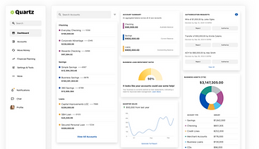
The Dashboard is made up of four key regions that create a cohesive and configurable desktop experience. The background serves as the foundational canvas and can either be a solid color or an image, helping set the overall tone of the interface. The container sits at the center and houses the primary content—whether it’s tables, charts, or forms—and supports options to adjust color, border, and shape for better alignment with brand or accessibility needs. The navigation is the main access point for moving through the dashboard and can be placed either vertically or horizontally, with customizable styling like color, transparency, elevation, and shape. Lastly, the footer provides a space for persistent links or legal text, and can either float, blend in, or carry the same visual properties as the navigation and container depending on user preference.
BACKGROUND OPTIONS


Color
Gradient
Image
A single solid color for a clean, minimal look. (Default)
/*Background Styles*/
background-color: #FFFFFF;
A smooth transition between colors that can be styled to fit your layout—linear, radial, and angular.
/*Background Styles*/
background: conic-gradient(0deg at center, #D29AF3, #79197B);
Use a custom photo or graphic to personalize the page background.
/*Background Styles*/
background-image: url("mountain.jpg");
CONTAINER STYLES


Light
Dark
Glass
The default styling. It's clean and works across all background types and keeps attention on the content.
A bold, high-contrast option that’s easy on the eyes and perfect for layouts that benefit from depth and drama.
A modern, elevated finish that adds polish without overpowering the layout.
background-color: #FFFFFF;
background-color: #1A1A1A;
background: linear-gradient(0deg, #FFFFFF 0%, #FFFFFF 100%);
opacity: 0.1;
backdrop-filter: blur(150px);
border: 1px solid transparent;
border-image: linear-gradient(45deg, #FFFFFF 100%, #FFFFFF 0%, #FFFFFF 100%);
border-image-slice: 1;
opacity: 0.6;
NAVIGATION STYLES


Color
Gradient
Glass
The default styling. It's clean and works across all background types and keeps attention on the content.
A modern, elevated finish that adds polish without overpowering the layout.
A smooth transition between colors that can be styled to fit your layout—linear, radial, and more.
background-color: #C7409E;
/*Background Styles*/
background: radial-gradient(circle, #FFAA48, #E85A2B);
background: linear-gradient(0deg, #FFFFFF 0%, #FFFFFF 100%);
opacity: 0.1;
backdrop-filter: blur(150px);
border: 1px solid transparent;
border-image: linear-gradient(45deg, #FFFFFF 100%, #FFFFFF 0%, #FFFFFF 100%);
border-image-slice: 1;
opacity: 0.6;
FOOTER STYLES


Color
Gradient
Glass
The default styling. It's clean and works across all background types and keeps attention on the content. Footers can also have no styling as well.
background-color: #529D67;
A smooth transition between colors that can be styled to fit your layout—linear, radial, and more.
/*Background Styles*/
background: linear-gradient(45deg, #B1C9FF, #11469F);
A modern, elevated finish that adds polish without overpowering the layout.
background: linear-gradient(0deg, #FFFFFF 0%, #FFFFFF 100%);
opacity: 0.1;
backdrop-filter: blur(150px);
border: 1px solid transparent;
border-image: linear-gradient(45deg, #FFFFFF 100%, #FFFFFF 0%, #FFFFFF 100%);
border-image-slice: 1;
opacity: 0.6;
ATTACHMENT STYLES


Attached
All layout elements sit flush against each other with no spacing in between—creating a seamless, edge-to-edge look.
gap: 0px;
Detached
Each layout element is surrounded by padding, leaving visible gaps between sections for a more modular, “floating” appearance.
gap: 40px;
ELEVATION


Flat
A clean, grounded look with zero elevation and no blur — great for minimal, seamless layouts.
Raised
Adds subtle visual hierarchy with soft shadowing and depth — best for modals, cards, or layered UI.
box-shadow: none;
backdrop-filter: none;
box-shadow: 0px 4px 4px ;rgba(0, 0, 0, 0.10)
backdrop-filter: none;
FORMATION
Shape
While not a new configuration to the Dashboard–the shape of an element influences how soft, sharp, or rounded it appears. While shape is largely a stylistic preference, it must be applied consistently across components to avoid visual tension. You can’t pair a sharp navigation bar with a rounded container — the styles would clash. Elements that take shape include containers, quick action buttons, input fields, cards, nav items, and more.


Sharp
radius: 0px;
Soft
radius: 8px;
Squircle
radius: 16px;
Round
radius: 24px;
FRAMES
Exploring Dashboard Curvature
The dashboard is no longer one-size-fits-all. What was once a static layout with default white backgrounds and limited navigation color updates has transformed into a fully configurable experience. With new options like color backgrounds, gradients, background images, adjustable radius, and more, designers can now craft dashboards that reflect brand, tone, and personality — not just functionality.
Glass Effect


Dark Mode


Colors & Gradients


MVP
Original Dashboard
The previous dashboard served its purpose. It delivered content in a clear, functional way — and for a time, that was enough. But revisiting the design with fresh eyes raised new questions: Is function alone enough? What opportunities are we missing by not offering more flexibility, personalization, or visual distinction? This isn’t about fixing something broken. It’s about recognizing when “good enough” has quietly become limiting — and choosing to evolve. The only configurations were Color and Shape.


Primary
Applied to key elements like the page header and high-priority call-to-action buttons.
Secondary
Used for supporting accents, such as quick action buttons or links — offering subtle hierarchy without full visual customization.
COLORS
SHAPE
Round
Squircle
Soft
Sharp


CONCLUSION
Shifting the Standard
Sometimes you don’t realize how restricted you’ve been until you’re finally given freedom. For a long time, the dashboard existed within silent constraints — not because users demanded them, but because “what’s always been” quietly became “what still is.” And just because something isn’t broken doesn’t mean it’s working. This shift wasn’t about reinventing the wheel — it was about removing excuses and giving teams the freedom to differentiate. Customization isn’t always about what research proves users want. Sometimes, it’s about giving internal teams the flexibility to present something that looks and feels elevated — especially when your platform is sitting next to a competitor’s in a pitch deck. The ability to personalize screen layout, reduce eye strain, or simply express brand identity? It’s more than aesthetic. It’s strategic.
Problem 🧩
The original dashboard offered almost no configuration. It was limited to just applying a pre-selected primary and secondary color to the navigation and buttons. There was no control over layout, shape, elevation, or styling — making every instance feel flat, rigid, and repetitive.
Solution 🔧
We introduced a flexible configuration system that allows users to control shape (curvature), style (solid, glass, gradient), and elevation (flat or raised). With just a few toggles, teams can create dashboards that feel aligned to their brand, tone, and audience needs — no dev lift required.
Impact 🚀
This new system transforms the dashboard from static to expressive. What used to be one-size-fits-all now becomes fully modular, empowering users to design interfaces that actually reflect who they are. The average session duration on the dashboard increased by 24% after launch
ROLE BREAKDOWN
Contributions
From ideation to documentation, I played a key role in bringing this experience to life — balancing strategy, standards, and hands-on design.
Built Early-Stage Prototypes
Utilized HTML to go beyond the limitations of Figma and Protopie. This let me test real interactions, behaviors, and layering logic before reaching high fidelity.
Explored Edge Case Combos
Explored extensive dashboard configuration combos across navigation, footer, background, and container types—bringing visual flexibility to life with modular, plug-and-play styling.
Anticipated Constraints
Strategized around visual constraints, like why a glass blur effect would be ineffective on solid backgrounds, and used those insights to guide design recommendations.
Designed for Scalibility
Ensuring the dashboard could serve both retail and enterprise users. We created two distinct dashboard views for both Commercial & Retail banking users.
Designed for Responsiveness
Considered responsive behavior across layouts—mapping how elements would pin, snap, or stretch in different screen sizes.
Defined Attachment Logic
Led conceptual thinking on attached vs. detached layout components, helping establish when modules should feel integrated or float independently.
Established Design Standards
Created visual/interaction standards, defining states, behaviors, and design tokens to support both flexibility and consistency.
Mocked Dashboard Data
Curated realistic KPI content, anticipating how tools like spend summaries or trend charts might look and behave—critical since the product never had a dashboard before.
REFLECTION
Final Thoughts
While this effort was framed as a UI polish, it quickly became clear that the impact extended far beyond surface-level aesthetics. The work demonstrated how thoughtful configuration can position us as a stronger partner in a competitive space — especially for clients who are often stacked up against one another. As a white-label solution, we serve multiple institutions who, by default, offer nearly identical user experiences. Providing deeper dashboard customization not only reduces that overlap but also helps our partners stand out in ways that feel aligned with their own branding and platforms.
This project was a strong step forward in giving our clients more autonomy — bringing us closer to WYSIWYG-style flexibility. It’s a scalable foundation, with room to grow both in form and function. The only notable limitation lies in the container styling, which remains restricted to black, white, or a glass effect (triggered by background imagery). This constraint is intentional for now, ensuring performance doesn’t suffer — especially when end-users need real-time access to critical data. Dynamic image backgrounds or motion might feel exciting, but not at the expense of loading speed when KPIs are on the line.
If I could evolve this even further, I’d introduce additional layout templates. Right now, we offer three base layouts, but more prebuilt configurations could serve as a jumpstart for users who aren’t sure where to begin. Future iterations could expand on this system with drag-and-drop support or component visibility toggles — giving institutions the power to tailor their dashboards even more precisely to their needs.
Curious About The Work?
If you have questions, thoughts, or feedback — or just want to talk shop — feel free to reach out. I’d love to hear from you.
You can fill out the contact form here, and I’ll get back to you as soon as I can.
bottom of page